
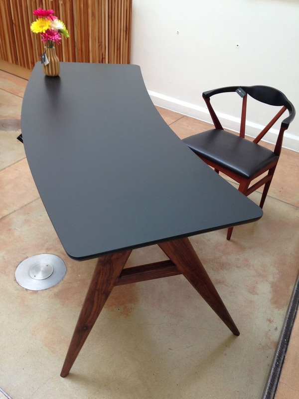
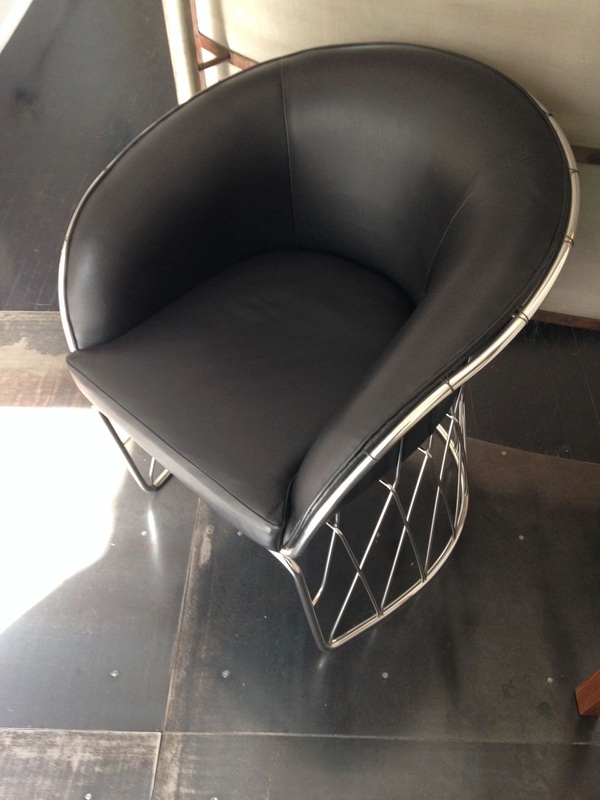
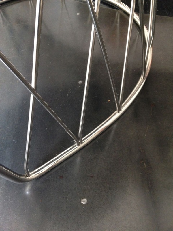
Here are some pieces created by our friends at Fabrica. The desk top is steel with automotive paint, and is super clean. The chair is a prototype, but the quality of the design and fabrication are as good as anything we get North of the border. If you haven't heard of them yet, you will. You can see them at the ICFF show in New York this coming May. Our neighbors are doing a lot of great work.
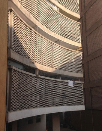 Here is some amazing precast concrete. Not only is it complex, it's curved. What I find even more special is that they bothered to do this not on the front, but on the BACK of the building, where it only benefits the residents themselves and their immediate neighbors. This was the view from the kitchen window of the apartment I stayed in in Mexico City. The laundry is a good indicator of scale!
The sad part is that we don't make precast concrete, or much of anything with any architectural intricacy, like this anymore. The exciting part is that in the very near future we will be 3D printing entire facades like this. The whole idea of 'craft' is about to change quite radically, and we will be seeing a lot of new ways of doing things. The possibilities are endless, but it's also great to have examples like this to follow. 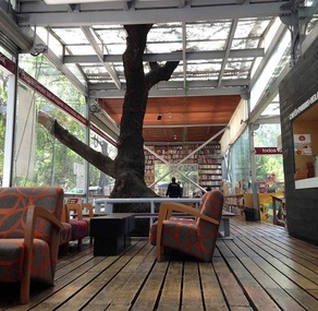 I was in Mexico City last week, for the first of what we hope will be many visits. The weather there right now is perfect, so the locals throw all their doors open and leave them that way. They really know how to blur the boundary between outside and inside.
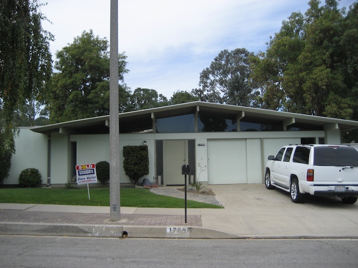
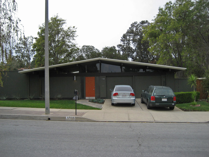
This is the bookstore and cafe across the street from the Anthropology museum, built right around an existing tree. Even though the building sits in a park with plenty of trees, they still chose to keep this one. This space would not be anywhere near so rich, engaging, and inviting without that tree there. And yes, the doors were wide open, too. Lovely. We have been talking about paint colors in the last few posts. Here is an anecdote that amuses us: After we replaced the siding on our own house, we painted it a very dark brown, bringing it into the background and giving it a quiet presence on the street. We discovered that this color was very close to the original color the house had. We gave it a hot accent color on the beam, though. This is always fun to do on Eichler houses. 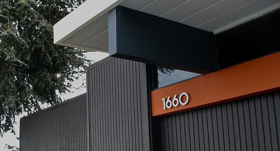
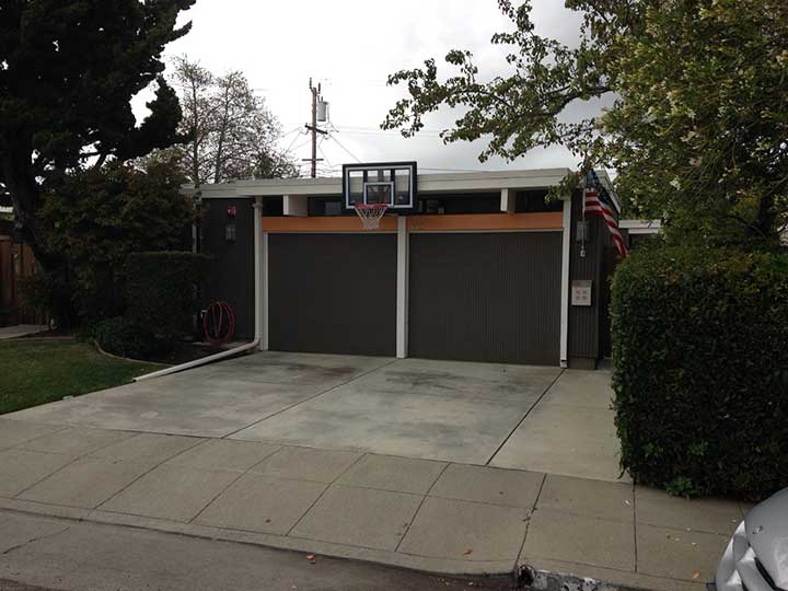
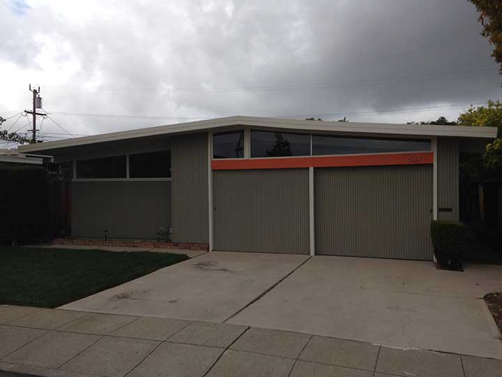
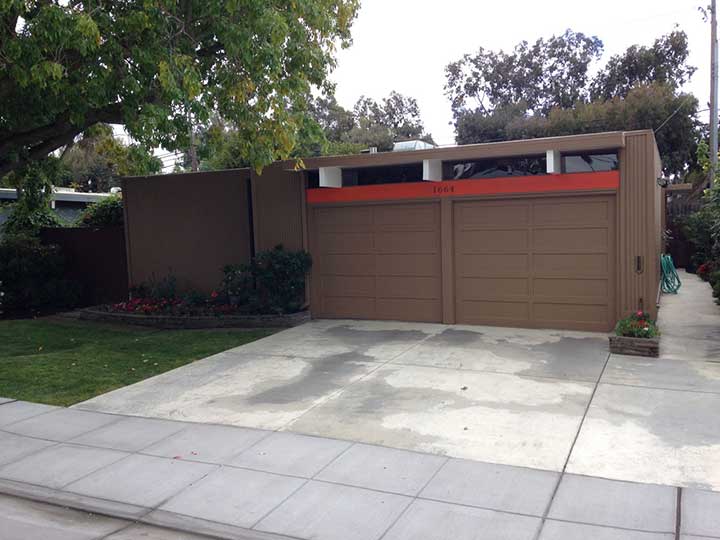
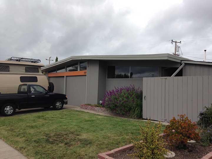
We did this 10 years ago. At the time, ours was the only house in the neighborhood with an orange beam. It was also one of the few dark houses. Then a house-flipper across the street copied our colors. Then the new owners of another house further down the street painted their beam orange. Slowly, more houses have toned down their color schemes and added orange beams. There are at least 8 of them in our neighborhood now. Here are few of them: We can't say how much, or even if, we influenced these homeowners, but we like to think we helped by setting an example.
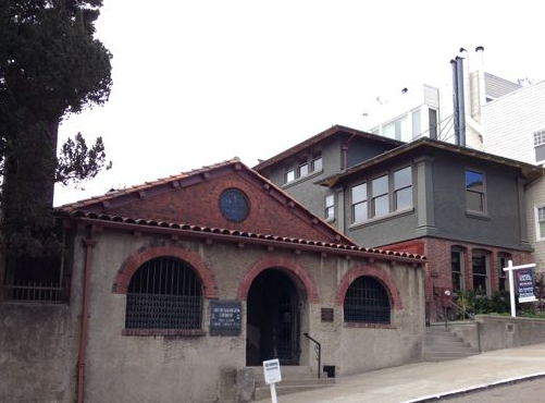
In our last post, I talked about using dark, natural colors to help blend modern houses into their surroundings. Here is how it worked for our friends Ted and Sally’s Eichler home in Thousand Oaks: We did it again with the parsonage house of the Swedenborgian church in San Francisco. This house was built in 1895, but the concept still works. Hopefully you'll agree it's easier on the eyes. We really enjoy painting. It can achieve enormous results with very little outlay. Change can be good.
We are privileged to live in an Eichler house designed by A. Quincy Jones in the mid 1950’s. He drew one of my favorite images of how single-family houses should behave. 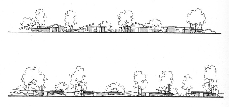
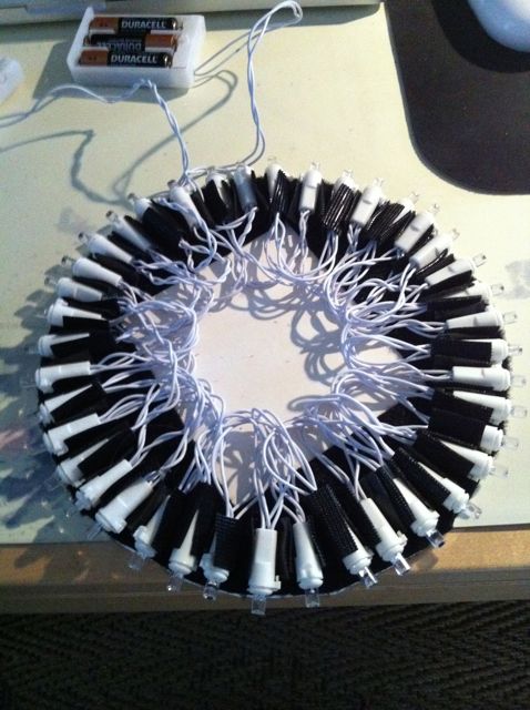
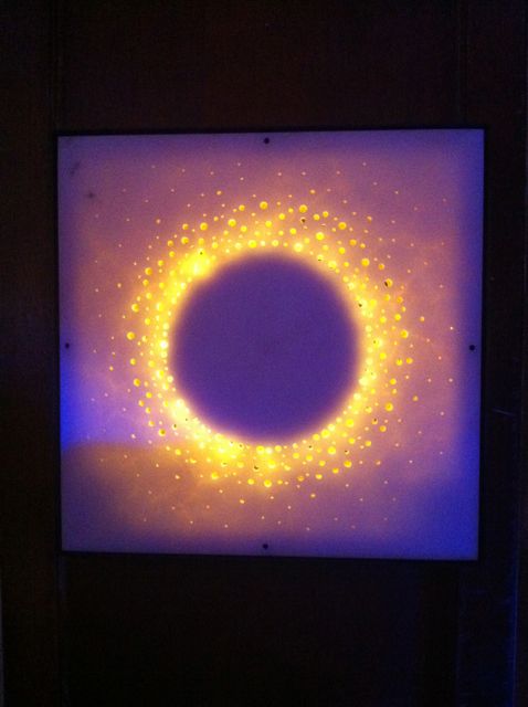
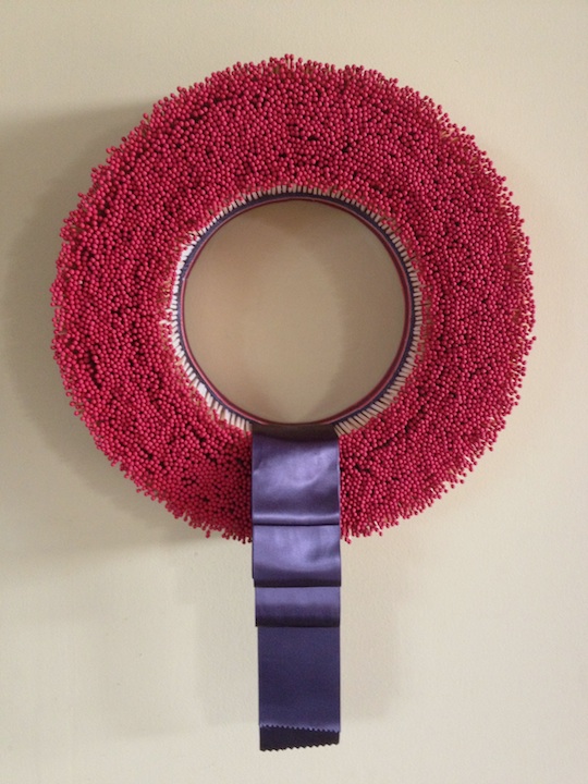
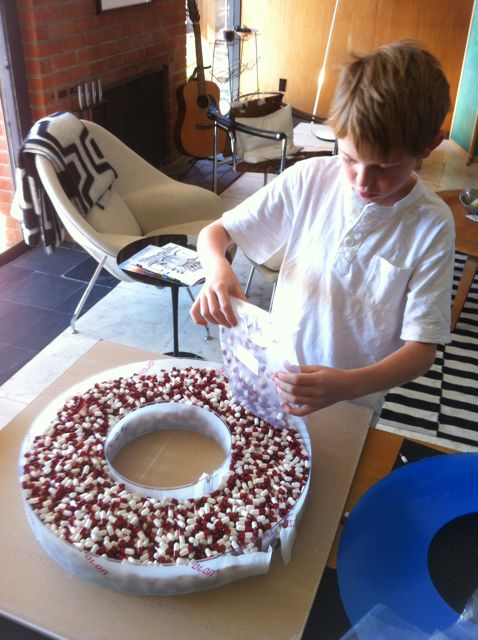
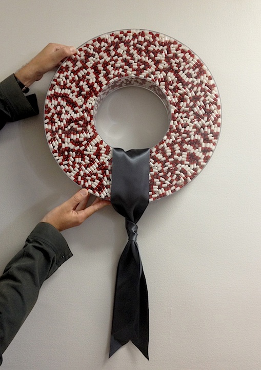
The top row shows the houses popping up out of a flat ground plane. The bottom row shows the ground plane morphed into small hills and berms, partially hiding the now lower-slung houses. This was Jones’ preference, and mine, too. Frank Lloyd Wright taught us to tie our buildings to the land, and it's always a good lesson. Taking this thought a step further, our choice of colors should also work with nature, especially for a modern house. Darker, earthier colors, found in nature, can give our buildings and their surroundings a richer feeling. Which brings us back to our house: These before and after shots illustrate these points well. We even have a little berm in front. We spotted this in the neighborhood recently:  What more can we say? Those chairs have got to go! December saw the annual benefit for Children of Shelters, helping underprivileged kids. For their Jingle & Mingle event, local designers create holiday wreaths, which are then auctioned off. Our friend Adam Gale got us into this three years ago. Our first “wreath” was a back-lit sheet of 3Form faux onyx, which we drilled hundreds of holes into and lit with an array of 40 LED lights. It was super cool, and a lot of work! We thought, “Next year we’ll do something less labor-intensive.” So what did we do? Hey There, Hot Stuff was made by gluing 5,000 matches into a base. No denying it was a great wreath, but it took MANY hours to make. We thought, “Next year we’ll do something less labor-intensive.” Clearly, we’re slow learners, but this year was slightly better. Happy Holidaze contains 3,500 “pills.” The tough part of this one was making the clear acrylic container, which looks easy, but wasn’t. The gel caps weren't easy to get, either. This wreath obviously struck a chord with people. (I wonder why?) It was a big hit and bidding was fierce before it was quickly scooped up with a $900 “buy-it-now” option. We are now known as a top-seller at this event. We have a lot of fun with it. Stacy already has ideas for next year. If I had to hazard a guess, I would say that it’s likely to have a lot parts and take a lot of time to do…
When I told Stacy I was starting to write blog posts, she asked, “Are you starting with a love letter?” At first the question hit me sideways, but a few seconds later I realized that she had a point: We love you!
When someone produces a piece of art and puts it out into the world, it is a gift. We can freely receive it, be moved by it, be inspired by it, absorb it into our experience of the world and be the richer for it. Isn’t this what we want to do for those we love? Stacy and I have spent our lifetimes looking at things, thinking about them, and allowing them to influence us. Here is where we can share some of what we’ve found. A lot of our observations are about design, but not all of them. We can learn about the creative process from actors, artists, musicians, artisans, nature, and yes, architects and designers, too. If we love it, we will want to share it - that's our gift to you. Regardless of the medium, the best pieces of art are the ones that come from the heart. Freely given. With love. |


 RSS Feed